By the time the University of Maryland had hired an architect to design its new School of Public Policy building, the project’s budget and proposed space were already 20% short of what the school needed, and it just got worse over time. “There was about a 12-year lag between when this program was envisioned and funded initially with the state and when we brought our architecture firm on board,” says Todd McGarvey, chief of staff of the School of Public Policy. “We had four research centers that didn’t exist that now account for about 40 faculty and staff. We didn’t have an undergraduate program; that showed up at 60% construction drawings.” The resulting building—Thurgood Marshall Hall—demonstrates some of the more creative ways designers and architects are doing more with less.
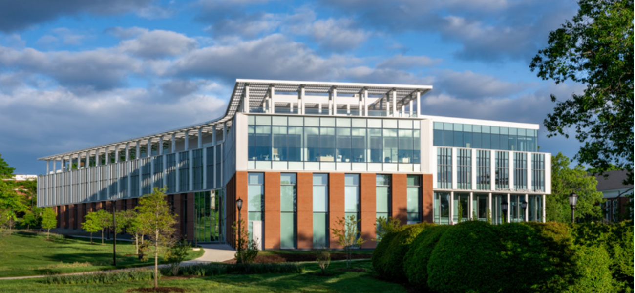
The new building—named for the first Black justice in the U.S. Supreme Court and opened to students in the fall of 2022—sits at the heart of the new entrance to campus as part of a reconfiguration tied to a new light rail line. Irena Savakova, global design principal at LEO A DALY, defines the challenge: “How do we take this absolutely amazing site and make the building that this school deserves, so that the students learning how to be effective, how to be creative, and how to be active in policymaking will be able to find the right learning environment?”
How Policy is Taught
Savakova and her team began by going back to the function of the school and its students’ needs, back to the ancient Greek notion of an agora—a public space where people can gather and discuss the issues of the day. “That’s how policymaking originates,” says Savakova. The notion found life in the way the design carved out multiple spaces for informal conversations and meetings—“pockets of areas where people can stop, can contemplate.”
The design team went to work finding interstitial spaces, especially those that had access to natural light. “Every single little area was utilized for either study or collaboration space or an area of repose,” says Savakova. She points to a line of sight that goes across the building, with study areas on each end. “Your friends can see that you’re there and they can find you, which is really important on campus,” she says.
One 46-seat classroom, the “deliberative chamber,” is patterned directly on the general assembly hall at the United Nations. “This is completely wired for videoconferencing at every seat, with tracking cameras that allow us to connect with other students, speakers, and experts all around the world,” says McGarvey. By adding lines of sight into the space from outside, it became a place where passersby can see that something exciting is happening.
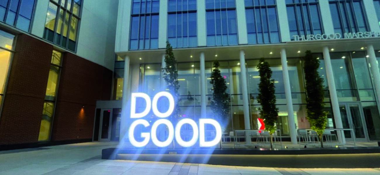
Nearby is what the school is calling the Do Good Plaza, so named because the slogan DO GOOD is illustrated in a light sculpture as part of the Do Good Institute in the School of Public Policy, inspiring students to care for their communities and their world. Students have claimed one of the nearby “areas of repose” as a brainstorming space.
Savakova argued passionately for one space that some university stakeholders wanted to claim for offices. It’s near the west entrance into the building and sits on a corner. “I insisted that this last space is part of the lobby, with the elevators, stairs, and everything there. The hallway wraps up and it becomes this democratic space of study. It belongs to everyone. Nobody can take that corner office,” says Savakova. Instead, it became a small study area that accommodates four to eight people.
The corner study space is visible at night, which helps contribute to the perception of the school as a place where things are happening. “You’ll come here at 9 o’clock and there will be people here at all times, although the faculty is already home. This is that lantern that you see at night. This was the space that was worth pushing for and keeping in place,” she says.
Rethinking the “Library”
The team had many discussions about including a library in the building. “I lost count at some point of how many configurations and how many different layouts we went through with that space,” recalls Savakova.
Ultimately, they decided to replace the traditional library—stacks of books and fully staffed—with a flexible space that can be used for quiet study as well as events. The books were given away, but they decided to call this space “The Reading Room” for sentimental reasons. Students can access a glass folding partition that blocks off part of the room as a seminar or small-group meeting space, while the main area opens onto an outdoor terrace that is used for events when weather permits. The terrace, which connects to a walkway leading along the building, has become one of the most popular event spaces on campus.
“We have been inundated with requests,” says McGarvey. “It is the sort of space that didn’t exist on campus before.”
Prioritizing Light
“Light was one of the key factors of making the appearance of a much larger structure that we didn’t have the liberty to build at the time,” says Savakova. “In the end, we finished with a building that did not have a single office that did not have daylight coming into the space.” That includes the spaces that are partially underground because of the grade of the site.
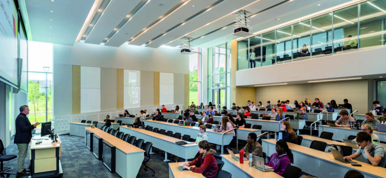
Natural light was also a priority in the design of the auditorium. That makes it unique on campus—other large lecture halls have windows, but the natural light at Marshall Hall’s auditorium stands out.
University stakeholders were leery at first of the plan for auditorium windows. “This was the all-purpose classroom that belongs to the University of Maryland. I had to convince them that, yes, these windows will have shades. Shades have existed for a long time. There are remote controls for all of this,” she says. “This will not distract the students and prevent them from being engaged.” The result? A room that is constantly booked.
The team also added a seminar space at the back, tucked into the top level of the two-story auditorium, and extended their technological reach to accommodate events that are larger than the physical space allows. “Once or twice a year, we have the need to host 500-person-plus events. It’s not justifiable to put a 500-person event center in there,” says McGarvey. “Using the lecture hall and deploying technology, we were able to push to be the first building on campus that entirely pipes audiovisual over the network.
“We can pull our video and audio streams from any of our rooms and project them out into all of our displays around the building, including a large-format screen that sits at the back of the lecture hall,” he explains. “In this way, we can create overflow spaces throughout the building when we have those one-off but important events. In just the lecture hall and the atrium area, we nearly double what we can put in the auditorium,” says McGarvey. Between the outdoor spaces and the digital connections, the building can accommodate up to 800 people.
The space squeeze meant more tradeoffs. Many faculty members do not have assigned offices, a transition that took some diplomatic effort. “This was done through multiple workshops and open conversations,” says Savakova. “We eventually got the buy-in of the faculty.”
In the time between the original plan and the opening of the building, many things changed, including the field of public policy itself, the ways in which it is taught, and the ways people use buildings. Savakova says she’s proud of what they were able to accomplish even with budget and space limitations—or, perhaps, because of them.
“They cannot be happier with the facility that they have,” she says. “They’re even going to have a lecture for their architecture school, so we can talk through all the stages of challenges and the success story for the building.”
By Patricia Washburn


