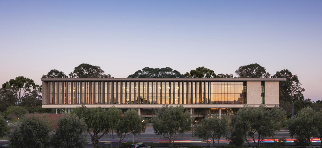
Completed in 2021, the Stanford Center for Academic Medicine not only supports the academic and research endeavors of the school’s clinical faculty and staff—primarily clinical trialists and clinicians working in hospitals and clinics—it also provides respite for these professionals who work long hours. The 210,000-sf facility includes private offices, conference rooms, collaboration and education spaces, a fitness center, and a restaurant-style café.
The Center was designed by HOK, which worked closely with the medical school’s leaders to develop a detailed program to provide medical education faculty and staff with a highly collaborative work environment in addition to amenities to support their wellbeing. What was once a parking lot on the edge of the clinical campus is now a welcoming and largely elevated structure that serves as a threshold between the Palo Alto medical campus and the verdant,1,000-acre arboretum designed by Frederick Law Olmsted.
“We had these programmatic goals that we wanted to satisfy,” says Niraj Dangoria, associate dean for facilities, planning, and management for the School of Medicine at Stanford University. “But we also had this phenomenal opportunity to create something very special and unique, establishing a new gateway to the Stanford campus.”
The project team seized the opportunities afforded by the adjacent forest to rethink how the built and natural world could converge to create a diverse and rejuvenating mix of indoor and outdoor spaces. The project sets new benchmarks for space use, program productivity, and healthy work environments. Most importantly, the team delivered on their overarching goal: to create a building where users might feel better when they leave than when they arrived.
The Humans Behind the Research Machine
Stanford’s School of Medicine is small by design, with 2,300 faculty and 1,500 students, all actively engaged in research. But its ambitions are significant, with around $700 million in funded research generated by the faculty.
These individuals straddle two worlds: the clinical and the academic. “Few faculty members are full-time practitioners,” explains Dangoria. A six-month study revealed that what faculty wanted most was private workspace—a sign of status in the university environment as well as a practical need when juggling research, clinical care, and academic responsibilities.
Amenity spaces were also high on the wish list. Surgeons, doctors, and clinicians can start their days as early as 5:30 a.m. in the hospital or clinic, performing administrative work later in the day, and heading home after 6 or 7 p.m. Offering the opportunity to destress quickly became another project priority. “They told us that they wanted to feel better when they left the building than when they arrived,” says Dangoria.
Phenotyping and Flexibility
“There were a range of other places that people needed, not only to work, but to gather together with one another, to think, to rejuvenate, and to get those core support services,” says Julia Cooper, director of consulting at HOK, who worked on preplanning strategies.
The project team developed an analytical phenotyping process to better understand user needs—how different people were using space in different ways. Clinical faculty, departmental leadership, research and administrative staff, research fellows, and residents fell into distinct phenotypes. Each phenotype was associated with certain work profiles, schedules, and space needs, which informed office distributions and assignments. “That drove our decisions about the space,” says Cooper. They calculated a set of ratios—spaces required for each phenotype and how often they were likely to be used—which drove the test fits.
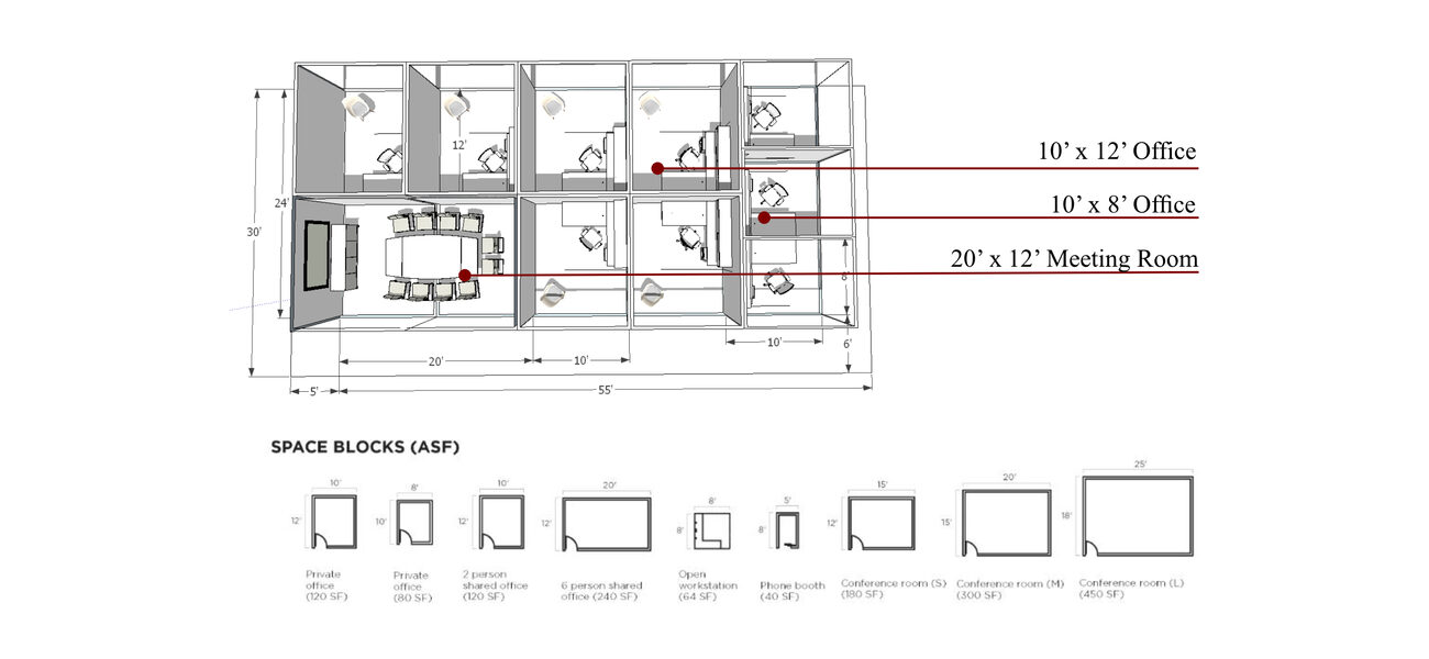
The project team also built in levels of flexibility to accommodate how needs might evolve in the future. “The modular approach allows for easy reassignment of spaces, or consolidation of multiple spaces into a single larger space, should the need arise,” says Cooper.
The finished design promotes collaborative, intellectual, and scientific activity among clinical faculty by enabling better access to the people who support faculty on a daily basis, adequate adjacencies among synergistic departments, and the flexibility to be responsive to the evolving needs of the occupants.
Inspired by the Forest and the Trees
The project team also took design cues from the arboretum. “Stepping outside our traditional boundaries as architects and planners, we began to conceive of an environment modeled on aspects of the forest,” says Paul Woolford, design principal at HOK and project design team leader.
They decided to elevate much of the building to align it with the top of the trees. Inspired by the color palette of the arboretum, they used similar tones to mark the building vertically, and planted or replanted native species—including Pacific madrones, wildflowers, and manzanita shrubs—throughout the center. “It feels seamless,” says Woolford. The Great Room, a two-story space for faculty, is cantilevered toward the forest so that it appears nestled in the trees. The building is so integrated with the arboretum, it’s affectionately referred to on campus as “the tree house.”
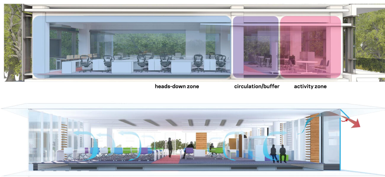
The ventilation and energy strategies were also influenced by the building’s natural surroundings. At the crown of the trees, it can be 85 degrees on a very bright and sunny day, but down below it can be 10 to 15 degrees cooler, thanks to prevailing winds and shade. The project team used dynamic computational models to design spaces within the building that had just the right amount of breeze or covering to feel conditioned without mechanical assist and took advantage of solar opportunities, as well.
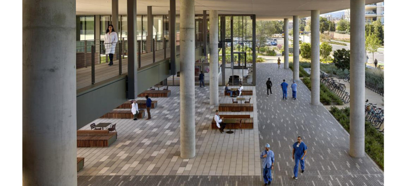
In addition, the project team turned the building inside out. Depending on the time of day or year, someone might want to sit in a courtyard or on a covered terrace or take a walk outside, so HOK proposed moving 20 percent of the program area outside but under cover. “We moved circulation out of doors, so our primary circulation route happens as you move around the building,” says Dangoria. This profoundly improved energy performance: The center was working at 16 EUI (energy use intensity) when it opened. “We believe that the building will achieve net-zero energy as the university continues to expand its own commitment to renewable energy,” says Woolford.
An Equitable Design
The notions of equity and accessibility were also key touchstones for the project team, to make the center work for the occupants and also be welcoming to visitors.
The building matches the flow of a faculty members’ day, from their arrival at the 1,200-space underground parking garage to the elevator which exits to the ground floor café, where they could grab a cup of coffee. From there, they might walk over to the hospital, heading back to the center for lunch and a walk or workout before heading into a meeting or to their office. “Accessibility was primary,” says Woolford. “If it became a burden, if it became too long a walk, then people weren’t going to come.”
The office space that faculty most desired created a challenge. “We are strapped for space, and everybody knows it,” says Dangoria. They designed half of the offices as single-occupancy measuring 80 sf and half as shared at 120 sf, awarding the private offices to those faculty who spend more than half their time on non-clinical responsibilities. It was an equitable solution and an easy sell. “There was so much talk going on about faculty not having offices at all, that when we said we were going to give them offices that are 80 sf, they were happy,” says Dangoria.
The workspaces on floors two through four are 70-foot-wide peninsulas designed as neighborhoods, with equitable access to a variety of open and closed collaboration spaces, which are essential for clinical research. “Defining the workplace was a balancing act, particularly between private and shared environments,” says Cooper. “We focused on meeting faculty needs for privacy and concentration while providing open, flexible spaces for collaboration. Community hubs were as important, if not more so, than individual offices.” Within the center, most users are never more than 15 seconds away from such a space. The project team had to work through how to provide appropriate buffers between quieter and more active spaces, but ultimately, it’s the desire to be part of community that draws faculty to the new center.
Just as importantly, no one is ever more than 30 feet from a window. “Shared sunlight was a big, desired outcome with our focus on equity,” says Dangoria. “We didn’t want perimeter faculty offices getting all the sunlight and the staff sitting in dark spaces.”
The center was also built to be inviting to non-faculty and staff. Most university buildings “are designed to have presence or to create a kind of brand identity for the program that rests within them,” says Dangoria, “but they don’t necessarily bring you inside.” The Center for Academic Medicine, with the bulk of the enclosed space lifted off the ground, invites anyone to move through the ground-level space without entering the front door. When the site was a parking lot fenced off by chain link from the arboretum, no one would walk that way unless they were going to their cars. Today, folks bicycle or walk through the center regularly. And while the workplace portions of the building are protected with key-card access, and the front door is monitored by the concierge staff, all are welcome to enjoy the café, which has been a big draw. “You can come in for coffee in the morning or lunch or have a beer and watch the game,” says Dangoria.
Bringing the Concierge Concept to Campus
Given the work schedules of the center’s primary users and their desire for a space that would add to their well-being, the project team took a page from non-academic development: the concierge building. “To have somebody there available to them when they wanted something was a unique proposition for us,” says Woolford, “something that had never been done before.”
HOK posited that a concierge desk could provide not only personalized service and attention but a stopgap for when there was an issue with building technology. It is the first thing you see when entering the center, staffed 24/7 by two concierges who greet the 1,000 faculty and staff members who work in the building and help them with package deliveries, appointments, reservations, and other services. Around the corner is the center’s version of the Apple Genius bar, providing on-demand tech assistance.
Across the portico is the café, with a staff barista serving Verve coffee and, further in, the experimental kitchen hosting nutrition classes in the mid-mornings and late afternoons before and after the lunch rush hour. The café’s serves restaurant-quality food with white-tablecloth service and a private 32-seat function room. “It is an added dimension to enhancing the quality of life for our faculty,” says Dangoria, and a great recruiting tool as well.
Next to the café sits the Grand Rounds room, which can seat up to 100 in varying configurations for presentations and events. And next door to that is the full-service gym with showers. As you move up to the third and fourth floor, the Great Room straddles the two floors, and is surrounded by conference rooms, a pantry and kitchen, outdoor workspace, and dining areas. “It’s the living room for the faculty,” says Woolford.
The center offers “a full complement of lifestyle options while also being a place of work,” says Dangoria. “Whether you want food, whether you want to exercise, whether you are having a meeting, whether you want quiet work, whether you want to feel like you’re sitting in a tree house, whether you want a place to relax or to be active—this building tries to support all of that in one day of the faculty member’s life.”
By Stephanie Overby


