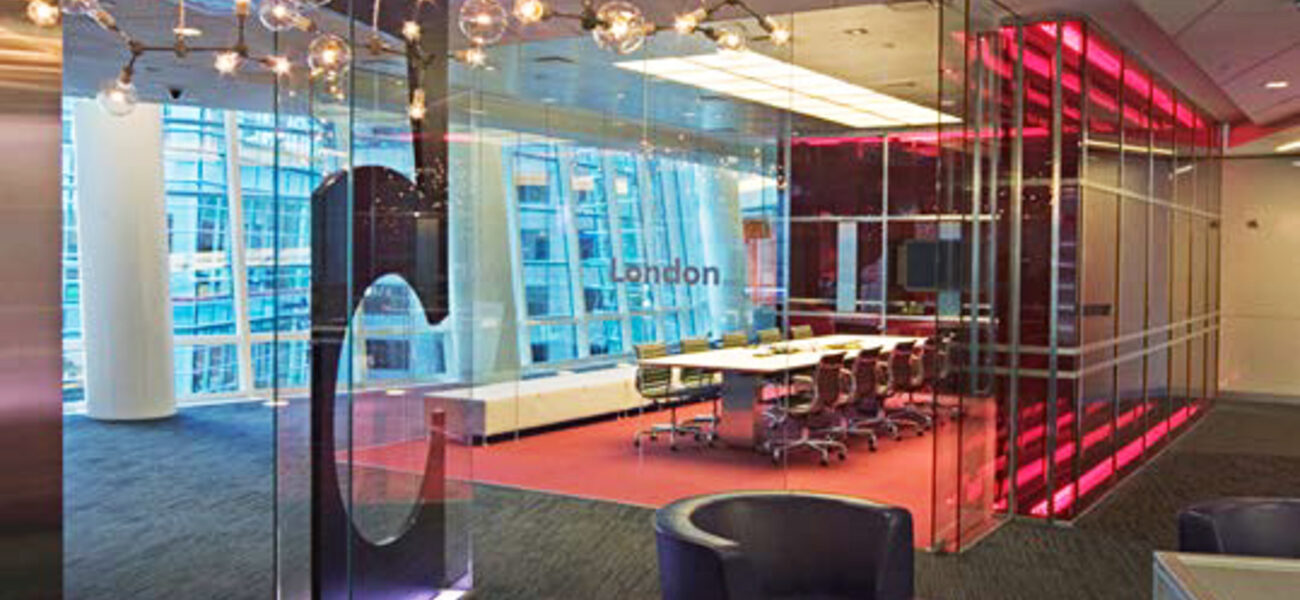
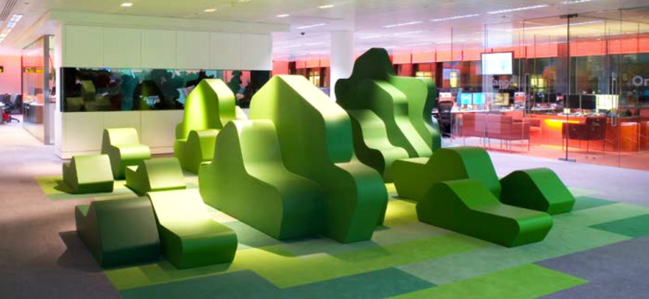
Color is the first thing your brain experiences in any environment, because the optic nerve connects the human eye directly to the cerebral cortex. Color has a deep subconscious influence on emotions, and studies have linked positive emotional states to improved decision-making, better memory function, greater job satisfaction, and creative problem solving. As a result, space planners are looking more than ever at how interior design colors influence mood and productivity in offices, labs, and classrooms.
“We are entering an era where everybody is going to open office layouts,” says Mark Zavislak, an interior designer at CH2M Hill/IDC Architects. “The question is: How do we use color to minimize the anxiety that comes with the culture change of an open office environment? One way to do that is by mimicking natural environments to produce a calming effect—lots of greens, blues, and yellows.”
Since color is really the reflection of light, all color planning must start by considering the interior lighting.
“Using red in a laboratory cleanroom with a yellow lighting filter is problematic because it changes the color to brown or grey,” says Marilee Lloyd, principal laboratory architect with CH2M Hill/IDC Architects. “So when you’re designing a space, you really need to know what the lighting is going to be in order to ensure the intended colors will react properly.”
Language of Color
The human eye sees different colors based on the amount of light each one absorbs or reflects. Consequently, color is described in terms of hue, saturation, and value.
“Hue is the characteristic that distinguishes one color from another,” says Zavislak, “so red is a hue, green is a hue, purple is a hue, and so on.”
Saturation, or “intensity,” of a color is a measurement of its purity in relationship to grey.
While the value, or “brightness,” of a color is defined by the amount of light radiating from it, luminance is the amount of light a hue reflects. Shade is the addition of black, and tint is the addition of white. Designers and architects also speak in terms of color temperature.
“Color temperature is the amount of white light,” says Zavislak. “The lack of white light equals a warmer color and the addition of white light equals a cooler color.”
Warm colors like red have the effect of increasing blood pressure and energy, while cool colors like blue have the opposite effect of lowering heart rate and creating a calm feeling.
“They actually did a study measuring occupant response to a blue room and a red room,” says Zavislak, “and subjects left the red room much more quickly than they left the blue room.”
Application and Influence
There are a number of rules for using color based on the desired outcome, each one contributing to different emotional experiences and optical effects.
“A color like red needs to be used properly,” says Lloyd. “That means it should be used in small amounts, and mainly when you want to bring energy to a space. It also has the effect of enclosing a space so you feel like the wall is coming at you. Using it in a space where you want to create energy is great, but you can’t use it in a space where you want people to do detailed tasks.”
“White can expand a room,” says Zavislak, “while dark colors, like black, compress a room. So if you want to lower a ceiling, paint it black. If you want to raise it, paint it white.”
However, too much white can be disconcerting and distracting. In a study of proofreaders, those who were working in a white room performed worse at editing and proofreading tasks than those working in a colorful room. Research also indicates that white inhibits touching.
“People don’t want to walk on a white surface or touch a white thing,” says Lloyd. “So if you want to psychologically inhibit people from touching something—like a museum exhibit—white is a good color to choose. Floors that are all white or all black can be very disorienting. If you are not concentrating closely on where you’re walking, it can feel like there is no floor there at all, which is why you’ll never see them in a hospital setting.”
“Orange is warm so it brings the walls towards you,” says Lloyd. “And it’s one of those colors you have to be careful with because it doesn’t always work well with people’s complexions.”
Green is one of the most restful colors for the human eye, which is why many healthcare environments and labs use it, along with cool tones like blue.
“The interesting thing about lab space is that you want it to be calm so occupants can focus on research,” says Lloyd. “But you also need to highlight areas that indicate caution and danger—like reds and yellows for flammable cabinets or toxic materials. So it’s about knowing when and where to use the right color.”
Color Schemes
Rules for combining colors, known as color schemes, also generate different emotional responses.
Monochromatic color schemes use variations in lightness and saturation of a hue to alleviate the boredom and monotony of using only a single color.
“Monochromatic schemes look very clean and elegant,” says Zavislak. “They produce a soothing effect that is very easy on the eyes, especially in blue or green.”
Analogous color schemes are similar to monochromatic schemes, but they use colors that are adjacent to each other on the color wheel—with one serving as the dominant color.
Complementary schemes use colors that are on opposite ends of the color wheel. Complementary schemes are more vibrant and provide more contrast and energy than monochromatic schemes.
“Complementary colors work well together because the human eye likes those two colors together,” says Lloyd. “It looks best when you place a warm color against a cool color and it is intrinsically high contrast.”
Triadic color schemes use three colors equally spaced around the color wheel. While not as contrasting as the complementary scheme, it looks more balanced and harmonious.
Using Color for Good
“If you’re working internationally,” says Lloyd, “it’s critically important to understand the cultural connotations each color has in different countries, so you can be sure you’re using it appropriately. For example, in Japan, yellow is the color of courage; but in Egypt, it’s the color of mourning; in Russia, jealousy; in France infidelity; and in Brazil, sorrow. So again, it’s a matter of knowing when, where, and how to use color correctly for the right emotional effect.”
In many situations, corporate brand colors can be adapted to drive a sense of inclusion and pride.
For example, executives at Bloomberg wanted to incorporate the brand’s color into the interior design scheme for their New York City offices as a way to reflect the energy of the company, so they used “Bloomberg orange” in the important spaces to create a sense of positive energy, newness, and brand spirit. They used blue for the huddle rooms and focus spaces, and a mix of red and orange in conferencing rooms.
“Color selection is something that should happen as part of the entire space planning process,” says Zavislak. “Unfortunately, a lot of corporate executives don’t take color seriously, so it often requires some education. As designers and architects, we need to start that conversation from the very beginning.”
By Johnathon Allen
This report is based on a presentation by Mark Zavislak and Marilee Lloyd at Tradeline’s Space Strategies 2014 conference.


