Even with large expanses of cubicles, the workplace environment at Intel’s new RA4, a seven-story office/factory building in Hillsboro, Ore., sports a fresh, contemporary look carefully calibrated to support the recruitment and retention of top employee talent. A combination of collaboration spaces and amenities, such as a 36,000-sf cafeteria that offers half a dozen different types of cuisine, along with an abundance of natural light and outdoor views, has produced a building that earns approval across the four employee generations that occupy the facility.
The appeal to the younger demographic, variously referred to as Millennials or Gen Y and Gen Z, born from the mid-1970s on, was a particularly critical driver of the RA4 design. Intel is very selective in its recruiting base, hiring from the top 2 percent of university graduates, a cohort that can be equally selective in its employment choices.
“Our business groups were concerned about the challenges they were having recruiting new people given our outdated and grey environment,” says Neil Tunmore, who, as corporate vice president for Intel real estate worldwide, directs the company’s workplace development and environments. “We had some candidates turning down offers because of this, and we hadn’t seen that before. They liked the job challenge, but not the working environment. It was important to build these learnings into the new building.”
Building Organization
Enhancing the employee experience was one of the chief goals of the design of RA4, which sits on Intel’s Ronler Acres campus with four other office buildings and four tech development factories.
The 1-million-sf RA4 is organized into a brick base housing two manufacturing floors, topped by a central amenity floor that includes the cafeteria, and then four glass-walled office floors. First occupied in 2014, the lower two office floors have been built out, while the top two are shelled and awaiting fit-out.
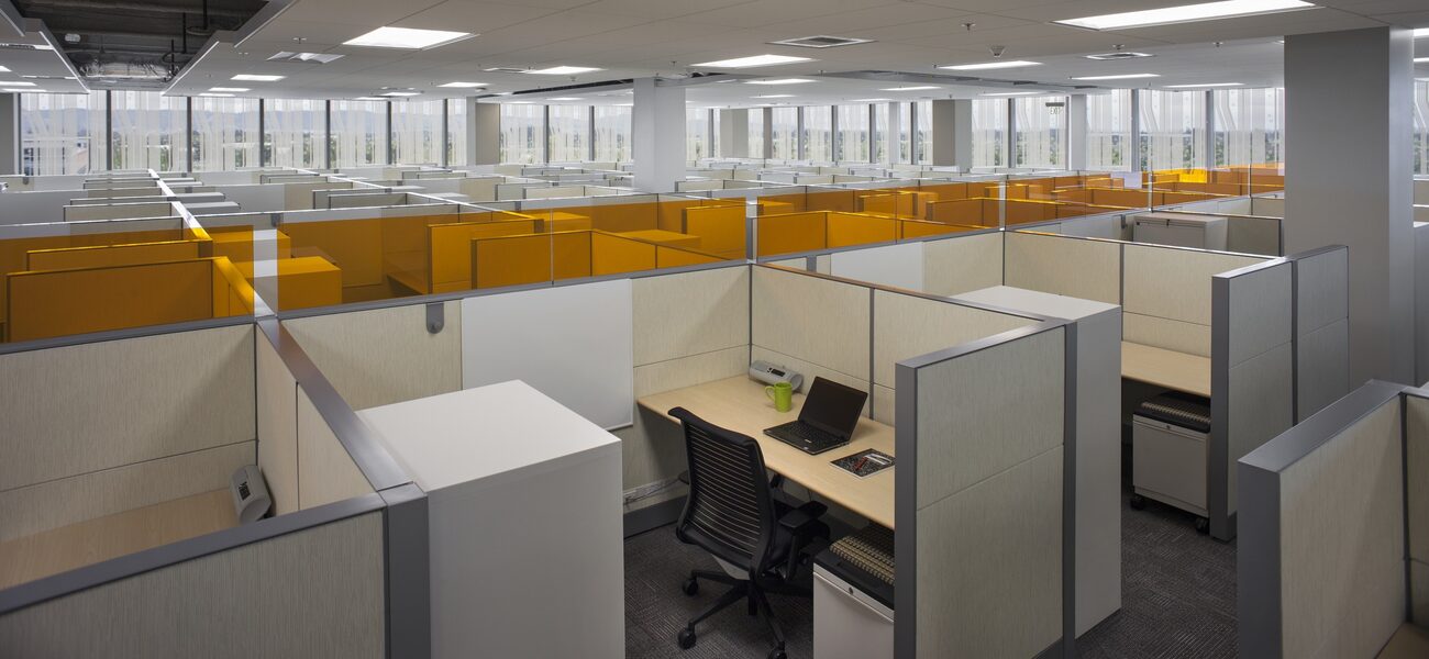
Almost half of each 114,000-sf office floor is devoted to workstations, a universal fixture at the company often regarded as the originator of the cube farm.
“Intel has always had a cube environment, from every level of management to the lowest employee level,” explains Tunmore. “Even our CEO works in the same size cube.”
However, this latest iteration introduces several design features that relieve the potential monotony of 800 workstations per floor, without making long-tenured employees uncomfortable in a drastically altered landscape.
“The further the change you’re driving is from the existing standard, the less satisfied people will be,” comments Tunmore.
Breaking Down the Floorplate
ZGF Architects LLP, Portland, Ore., developed a two-pronged strategy to reduce the large floorplate to a more human scale while meeting occupancy requirements.
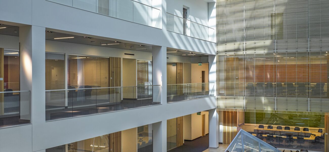
First, the cube areas—broken up into seven neighborhoods of between 65 to 180 workstations each—are pushed out along the large glass perimeter, maximizing employee access to daylight and view corridors. Second, a 90-by-30-foot atrium rises from the center of the building, allowing abundant natural light to penetrate the interior. Conference rooms and a lounge congregated around the atrium create an attractive environment for collaboration and interaction.
“The cores and the placement of the conference rooms and the lounges present a way to ‘deconstruct’ the floor plan,” says Sharron van der Meulen, ZGF interior design principal.
RA4 occupants are predominately engineers and Ph.D.s who do a lot of coding at their assigned workstation. When they are not at their desk, they are usually in a conference room solving problems or in a lab. Despite the advances in workforce mobility (many of which Intel itself enabled), providing for remote employees was not a significant design consideration.
“We are a company that believes presence is important to solve problems, hence the relevance of a well-designed workplace,” says Tunmore.
Individual workstations measure 6 feet by 8 feet, with 54-inch-high panels. This height is lower than Intel’s previous standard of 65 inches, and it makes a significant difference.
“It’s remarkable how much people feel impacted by reducing the wall height 11 inches, and also how much more natural light reaches the desktop,” says Tunmore. “Employees are able to see each other and make the kind of visual connections that foster collaboration.”
The cubes are furnished to maximize space. The work surface runs along the width of the enclosure, with a white board on the perpendicular panel and a tower storage unit on the opposite side. Even though most employees work on laptops, the desktop is equipped with a large-screen monitor and remote mouse and keyboard, to satisfy ergonomic concerns. Instead of a bulky visitor chair, a pedestal file with a seat pad can be rolled out from under the desk to accommodate impromptu collaborations. Telephones are largely absent, replaced by Intel’s widespread use of Skype™. Most online work is done via WiFi, although “a high-bandwidth engineer might have a wired connection,” says Tunmore.
To break up the mass of cubicle clusters, every so often a 15-inch-high color-coded glass panel runs atop a row of partitions, generally to delineate a functional group.
“This gives a little more clarity to the groups and teams working together,” says van der Meulen.
“We had a commitment to get 800 people on each floor,” comments Tunmore. “We did look at some alternatives that broke up the mass of cubes and added more collaboration areas in the center, but in the end we really needed to get the various teams together and on the same floor.”
Atrium and Conference Rooms
Sitting atop the cafeteria, on the lowest office level, the atrium floor is dotted with an assortment of furniture groupings to attract informal gatherings. Two asymmetric pyramidal skylights allow light from the soaring roof structure to reach down into the cafeteria below. According to van der Meulen, the pyramids, while functional, also add an “artful, sculptural” touch to the space.
Each floor has 52 conference rooms, in a variety of sizes, from four-person collaboration rooms to a large 70-seat room for training-type sessions. The atrium-facing conference rooms—understandably the most popular, because of their natural light—are equipped with switch glass, which transforms their floor-to-ceiling glass walls from transparent to opaque at the touch of a button.
The switch glass was an additional expense—about three times the cost of standard window glass and blinds, says Tunmore—but the security it affords was deemed a worthwhile investment.
“Everything that goes on in these conference rooms is considered to be private and confidential,” says ZGF architect John Thomson. “Employees often project images on the wall from their laptops or media screens, and the subject matter needs to be secure.”
As intended, both large and small conference rooms are heavily utilized.
“We have two types, bookable and non-bookable,” says Tunmore. “A lot of people only need a conference room for half an hour. They use our ‘phone booths’ or four-person collaboration rooms.”
These small rooms are equipped with a wall-mounted monitor to share information from employee laptops. A touch screen in the corridor displays room availability, “so people don’t have to hunt all over to find an empty room.”
Available only by reservation, the larger conference rooms have both projection and video conferencing capabilities.
“They are always all in use,” says Tunmore. “When you go for an appointment, you have to be really efficient with your time because of the back-to-back bookings.”
Each office floor is outfitted with an 1,800-sf multi-purpose lounge, affording additional work and gathering space. A kitchenette with a refrigerator and microwave offers food storage and reheating, while a large-screen TV enables employees to take a break to watch a sports event or socialize. The atrium also has a kitchen area for light meals and snacks.
“It is a great symbiotic group of programs, so people can grab something to eat or drink and go into one of the conference rooms or hang out in the lounge area,” says van der Meulen.
Cafeteria and Other Amenities
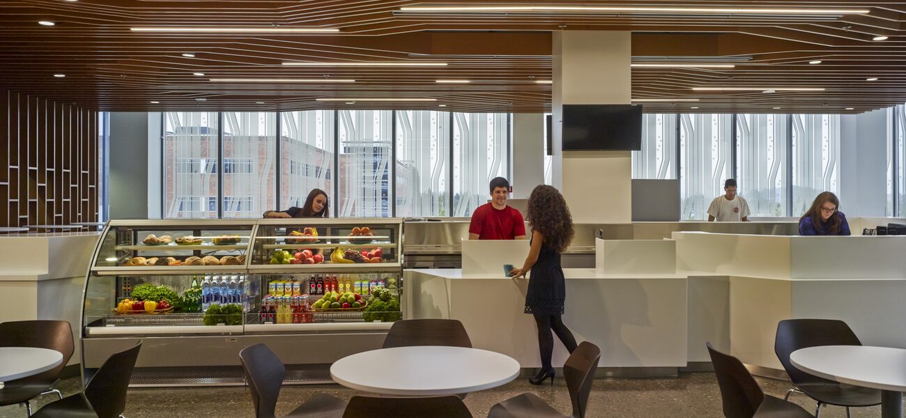
According to the RA4 vision statement, the cafeteria was specifically designed to create a new dining experience at Intel, “one that transports the customer from a work environment to a restaurant-like, retail experience.”
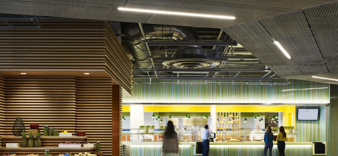
Inspired by the Boqueria, Barcelona’s historic open-air market, the 1,220-seat eating area is broken down into six separate entities. Each venue serves a different type of food, visually represented by a distinct choice of materials, lighting, and furniture. The variation in surroundings creates the sense of individual restaurants within a larger volume and gives the space a special vitality, notes van der Meulen.
A meandering path, also reflected in an overhead aluminum grid, clarifies circulation through the vast area.
“The ceilings are completely open except for over the venues,” says van der Meulen. “A Unistrut® grid allowed us to suspend lighting and architectural elements, creating different environments with different materials—for instance, the sushi venue with a lot of wood material as a ceiling surface. Lounge seating is available at the cafeteria’s points of entry, marking transition points from the staff entrance and access to the office floors.”
A 136-seat outdoor eating area adjacent to the cafeteria expands capacity while providing the opportunity to simply step out for a breath of fresh air.
“It is a point of respite for people who don’t want to take the time to go outside,” she notes.
In addition to the cafeteria, employees have another gathering option in the coffee shop, the first space encountered after passing through the security station. Other amenities on the entrance floor include a fitness gym with showers and lockers, “to accommodate the Pacific Northwest healthy lifestyle,” and a game room, bank, health clinic, auditorium, and meeting rooms.
“Collaboration is the key of this decade,” says Tunmore. “RA4 gives the Intel employee a lot of different varieties of seating to use during the course of the day. We see these as being an extension of the work area.”
By Nicole Zaro Stahl


