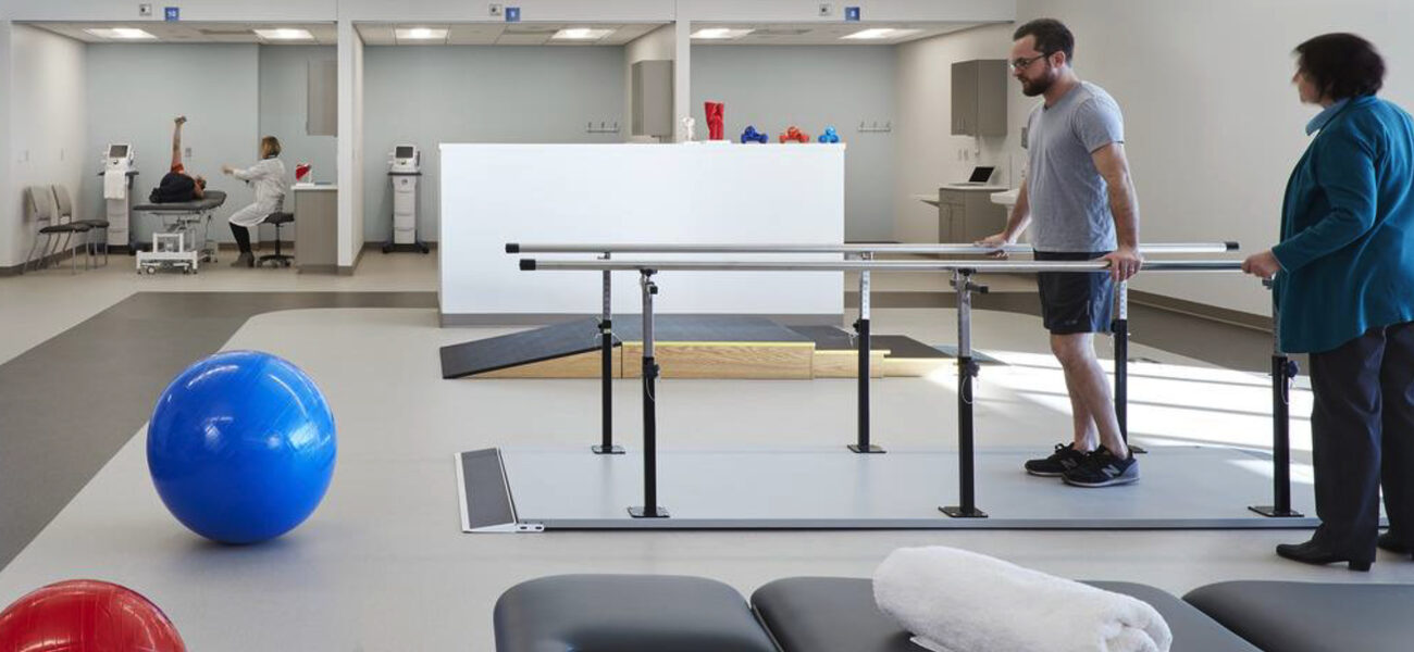
Health Sciences classes at the University of Cincinnati had been held in an outdated building with no windows, and that had to change. To support the mission of creating well-being and a sense of community, designers and administrators collaborated to create an open, attractive new facility with room to accommodate a variety of dynamic learning styles that can adapt over time. They held focus groups with various stakeholders, including students, and included features that would help occupants get through long days, such as a visible circulation to promote movement; kitchenettes to encourage healthy habits; hands-on learning components; a variety of study spaces to accommodate group work; and spaces for respite, promoting quiet alone time.
“We’re creating spaces to educate the next generation of healers,” says Jessica Figenholtz, Higher Education practice leader at Perkins&Will.
Former Burn Hospital
“My first goal was as much natural light as possible,” says Tina Whalen, who recently retired as dean of the College of Allied Health Sciences. The college had been housed in a 76,000-sf building that started its life as a Shriners burn hospital, in an era when sunlight was thought to be harmful to burn patients. Thus, there were no windows on the first two floors. “It was a great place to be in a tornado, but not the best place to study or work,” says Whalen.
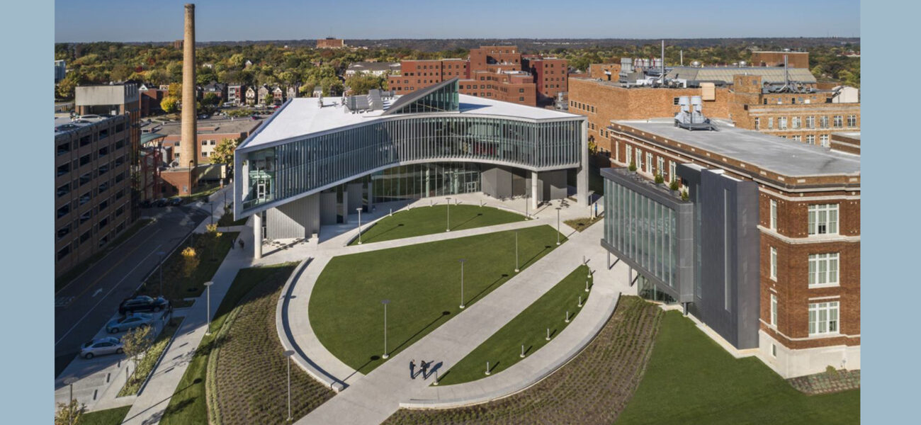
The new building came in at 117,000 sf—still not as much as the college needed but a big improvement, especially from the perspective of wellness. “I wanted a building that could be multifunctional, that could facilitate interprofessional interactions. The patients should be at the center, and the professionals should be around them, and the students need to know about the other professions,” says Whalen.
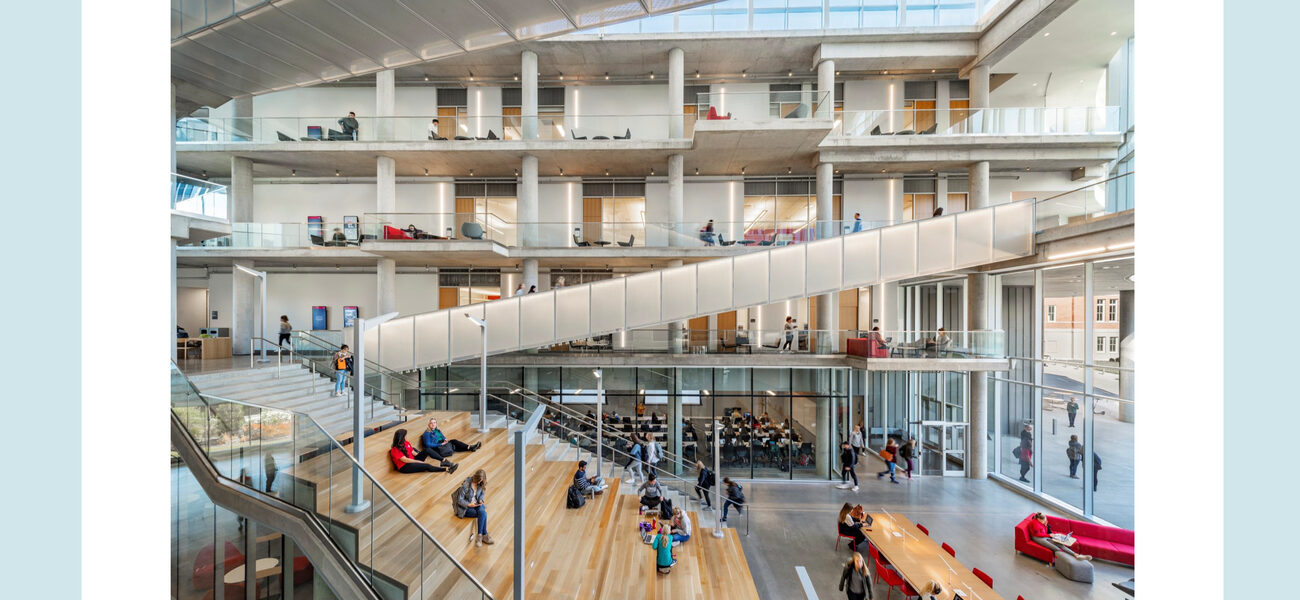
A soaring glass-lined atrium includes steps where students can hang out, study, and connect. The opportunity to mingle was important, because the college includes people in 32 different programs, most of whom will have to work with people in other disciplines once they join the workforce.
“On the first floor, the university and the college were adamant that they wanted to see learning on display with all learning, professional training, and research positioned around the atrium,” says Mark Jolicoeur, managing principal at Perkins&Will. “They wanted to see the students and what they are doing. They did not want the students just coming and going, but they wanted to have a place to truly spend their day and spend time. And, for the building, a visual connection. You could see and engage with what is happening in the rest of the building itself. Similarly, the connecting stairs go right through the middle of the atrium itself. As you’re going from the second to the third floor, you are experiencing what is happening in the building.”
Whalen says she’s pleased with the level of natural light the designers were able to achieve. “The effect it has on people’s mood and outlook has been amazing.”
Whalen tells a story of a recent visit from an older donor, who was sitting on a sofa in the main atrium watching a class in progress. The donor told someone walking by that he used to teach the same material, and the passerby invited him to join the class. Within minutes, the man was interacting with the instructor and sharing his experiences. “It was kind of the highlight of his life,” says Whalen.
“If the glass hadn’t been there, nobody would have known what was going on behind the door or behind the wall,” she added. “It was a serendipitous moment, but it made his day, it made the students’ day, and the instructor was very inclusive. It was great. That kind of stuff happens because we can see each other.”
To bolster that visibility, designers built in multiple opportunities for students and faculty to interact across programs and disciplines. “Interdisciplinary interaction, both formal and informal, in the educational classroom, in the lab, and just in general, was incredibly important to us, as students could learn to and from each other in our building, and with the College of Nursing, the College of Medicine, and the College of Pharmacy nearby,” says Whalen.
Green Space
As an additional spur to interaction, they set the new building back and created a green space that links it with the other health programs. “21st-century healthcare requires interdisciplinary education with the patient in the center and a strong connection between the indoor and outdoor experience,” explains Whalen. “So, we need those students to be running into each other."
The green space solved a number of problems. “It created an external sense of place, pushing back any kind of urban edge to soften the area,” says Jolicoeur.
The intermixture of classrooms, labs, and offices was also a deliberate part of the design. “We wanted the building to have destination locations for faculty and students, distributed both horizontally and vertically,” says Figenholtz. The new building has “neighborhoods that allow for serendipitous encounters, and encourages a stronger culture and high level of conversation that can spark creativity across the board.”
“There are lots of students on the stairs studying,” says Whalen. “There are outlets on the stairs, so they can plug in their laptops if they need to charge. The stairs also serve as a starting point for our campus tours, they serve as a stage for TED talks, and they serve as a natural connector for all that enter the building.”
Kit of Parts
The team knew that whatever the needs for the building on opening day, those needs would change over time, as medical science develops and demand for training waxes and wanes. To encourage flexibility, they adopted a “kit -of-parts” approach to modular office spaces laid out in different types of unit modules to form clusters. They also strategically placed shared kitchens and workrooms so that people in different departments would be encouraged to get to know one another and share information.
The ability to adapt the space was one of the requirements set by the college. “They know they need to flex,” says Jolicoeur. “This building has to adapt and be nimble. This concept was about creating these department neighborhoods, about sharing materials and workstations.”
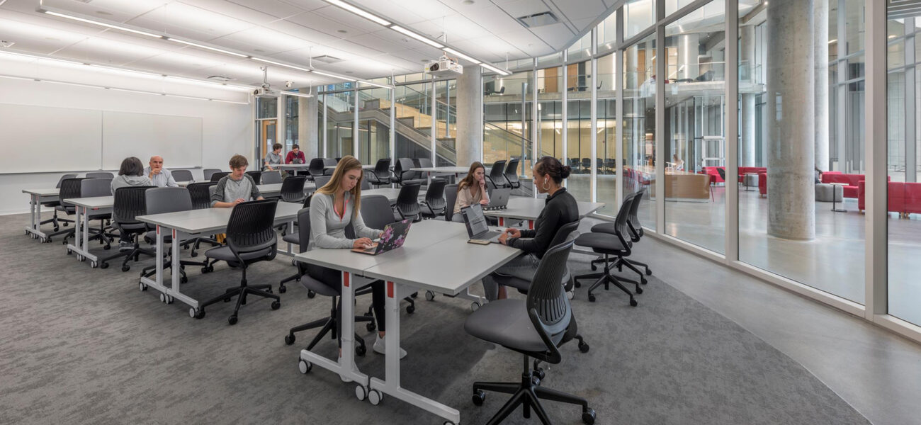
The flexibility extends to classroom furniture. “The largest classroom is intended to be an amphitheater type for larger groups,” he says. “But instead of having a sloped floor that limits the use of that space, we have utilized furniture solutions by providing standard-height and high-top tables and chairs. If we want to lower those tables and chairs and go into small-group work or turn it into a reception space in the evening, we can push things out of the way. Everything is on rollers. That has given the college major utility in the building while also maintaining eye contact to encourage engagement.”
Atmosphere of Growth
Enrollments are growing every year at the College of Allied Health, to the point where some programs have overflowed back into the former burn hospital. It’s not clear what effect the new building has had, but Whalen says it’s a net positive.
“When I walk into the building in the morning, I can see to the fourth floor and I can wave to people there,” she says. “People feel like they are part of something bigger than the program they are in. I think that is incredibly important, and I think the pandemic has made that even more important. As we come back now, that sense of place—the sense of belonging, a place where they fit and should be—has been incredibly important to the well-being of our faculty, staff, and most importantly, our students.”
The study spaces, green space, and atrium have even attracted visitors from the nearby medical and pharmacy schools. “I often see students with their laptops from our College of Pharmacy and the College of Medicine with our kids, everybody kind of mixed together,” says Whalen. “That is interprofessional. That is our goal.”
By Patricia Washburn


